In this short article we would like to introduce the notion of blending candlesticks, which will subsequently be followed-up by further detailed articles.
We can ‘blend’ different adjacent candlesticks to form a single candlestick, thus summarising the outcome over several periods in one candle. We can blend candles of similar frequency over any time scales for example, minute-by-minute candles, hour-by-hour candles or day-by-day candles. We can blend as many adjacent candles as we see fit. In effect, by doing this one gets a clearer insight into the evolution of market activity over longer time periods. Why would we want to do this? Well, first of all blended candles can create a single, stronger signal. Secondly, by blending candles one minimises market noise, thereby getting a more accurate reflection of the underlying activity. Thirdly, we can blend certain candles to see patterns, which normally wouldn’t be visible. Finally, continually watching individual candles play-out over short-time periods creates stress which can, and frequently does, result in prematurely stopping out/exiting positions; this can result in losses or less profit taking than originally targeted.
The importance the last point cannot be understated. The psychological aspect, reacting to short-term patterns, plagues most investors. Analysing groups of blended candles enables us to keep a focus on our trading plan, thereby restraining the emotional reaction arising from adverse short-term price movements. In other words, it helps us not to get caught-up in the noise and to stick to our original trading plan, waiting for stops or targets to be reached, as set at the beginning of the trade.
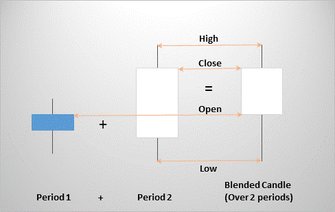
So, how does blending work? Very simply: first we decide how many candles we would like to blend, take the opening price of the first candle, the highest and lowest prices achieved across all candles and finally, the closing price of the last candle. Figure 1 show the position for two candles. We have a down period with a relatively large body for the first candle, followed by a period with a larger body, which fully engulfs the body of the previous period.
The two individual candles form what is known as a Bullish Engulfing pattern, the single resulting blended candle being a Hammer/Hanging Man. Because they basically look the same, we can only differentiate between them by context, i.e. the Hammer can be formed in a downtrend and the Hanging Man in an uptrend. The interpretation placed on the Hammer is that it signals a potential bullishness in the market, that is, a potential bullish reversal after a prolonged down trend. Please note however that blending Bullish Engulfing patterns not always results in Hammer pattern and we give this example here just to better visualize the blending process as such.
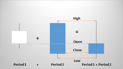
The merging of a Bearish Engulfing pattern of candles is shown in Figure 2, resulting in a Shooting Star (again, please note, that it does not mean that blending Bearish Engulfing results always in a Shooting Star).
As indicated above, this provides an aid in summarising the actions of the market over the previous two periods. The Bearish Engulfing pattern suggests market indecisiveness, where an up-period is followed by a worse down-period. However, by blending the two candles we may obtain a more insightful market signal. The Shooting Star is frequently formed after a prolonged advance, and signals a potential bearish trend reversal. The long upper shadow indicates that the bulls, the buyers, were able to dominate during the trading period, and subsequently, the bears, the sellers, regained the initiative with the price closing below the opening price.
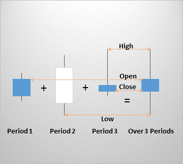
We can blend as many candles we like and the same principles as for two candles apply. For example, Figure 3 shows the blending of three candles:
To understand blended candlesticks it is important to grasp the how base time intervals are used in CandleScanner. The base time interval of the symbol is the minimal time interval which can be used for the given symbol imported into CandleScanner. For example, having imported the quotes of the EUR/USD symbol expressed in 15-minute time intervals, allows one to plot the chart as a 15-minute chart, or any multiple of 15-minutes (e.g. 30-minutes, hourly, daily). With the base time interval equal to 15-minutes you cannot, for example, plot the chart made up of 20-minutes candlesticks.
Some software on the market allows one to do this, but it does not make sense and, as a result, incorrect data is presented for the blending. When we have, let’s say, 15-minute quotes, it means that we have the following information:
- Open price when the 15-minute period begins
- Close price when the 15-minute period ends
- High and low price during 15-minute period
Subject to the above proviso, using CandleScanner you are able to blend as many candles as you like. In future discussions we will elaborate on the material presented here and provide statistics for different candle combinations. Furthermore, we will evaluate the success of different candle blends in arriving at profitable trading strategies.
In order to select the desired number of blended candles in CandleScanner, you select the ‘HOME’ tab and then ‘Other’ in the ‘Interval’ box. You will then see the screen with a pop-up window named 'Add interval' for the number of blended candles (refer to the User Guide for more details).
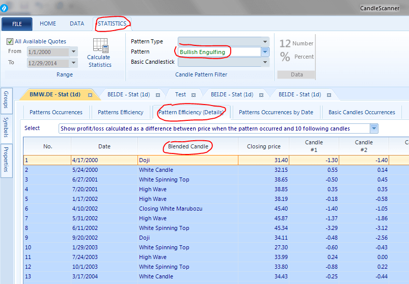
In CandleScanner, we can observe in the ‘STATISTICS’ section (highlighted below) the resulting blended basic candle of an underlying pattern. As a result of blending, we are looking at a basic candle, not the underlying pattern (which can, under certain conditions, can be regarded a specific one line pattern). Hence, blending can be used to build basic candles, which then can be used as a building blocks for other patterns which are more complex than the one line patterns.
We can see occurrences of the Bullish Engulfing pattern found for the BMW stock in the DAX index. When we blend two lines of patterns we always have a basic candle (one line), but not always the same line (e.g. we have doji, high wave, white candle, white spinning top, closing white marubozu etc.). In other words, although we are blending the same valid patterns (Bullish Engulfing) we can end up with a different basic candle after the blending process.
We can blend patterns which have more than two lines. For example, for BMW but now with a Three Inside Up pattern (three line pattern):
On the screen above we see how blending a three line pattern (Three Inside Up) is transformed after blending to different basic candles.
For reference, the Figure 6 shows the complete list of basic candles taken from the Patterns Dictionary in CandleScanner (for more please refer to the User Guide).
Blending candles can also be used in another way, namely, to spot the patterns which ‘normally’ would not be considered as a valid patterns. Here is the construction of a Bearish Engulfing pattern:
First candle:
- candle in an uptrend
- white body
Second candle:
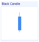
- Black Candle (basic candle)
- black body overlaps the white candle's body
Please note here that the second line in the Bearish Engulfing needs to be a Black Candle (the key thing here is that it has to be a black candle in a long line ). Here is the full specification for a Black Candle:
Construction:
- black body
- required lower and upper shadow
- none of the shadows can be larger than the body
- appears as a long line
Now imagine following situation on a chart (see the three candles in the red rectangle below).
Eyeballing the pattern may suggest that the first and the second candle, (the orange colored candle), would constitute a valid Bearish Engulfing pattern. However, the truth is that the second candle is a short line (here shown in orange, but in the CandleScanner color theme it would be marked in yellow) and the search algorithms in CandleScanner would reject this as a valid pattern (refer to the Long and short lines article for more detail).
If, however, we blend the second and the third candles we would end up with the valid classic Bearish Engulfing pattern. We can say that the second (orange) candle indicates less market activity, but, the following day the market is more volatile and in result ‘cancels’ the previous candle.
This last example is what we plan to add to CandleScanner. In other words, the trader will see the patterns which could be difficult to notice with the naked eye, without candle blending. We then show how this can be used to improve trading using candle patterns.


